Persona mapping exercise to determine the high level connections of work/comms between the customer and Hatteras.

High level workflow mapping of core steps, delineated by Hatteras vs. Customer ownership and personas.

A system of systems, we mapped how the data would flow between each node of the Navigator ecosystem to both capture our intent and also the gaps which needed to be closed from a backend perspective to make it happen.
The User Experience:
Once we had a good understanding of the problem space via research, we started to ideate and prototype solution ideas for the critical pain points and areas of high friction. Hatteras was already seeing the value of a formal UX process and was excited to make progress. So, we wanted to rapidly test/(in)validate our assumptions with the same groups of users (customer service, sales reps, and even some customers).

Early wireframe of an estimate dashboard for sales users yielded some important lessons learned on how both nuanced and fragmented the vernacular was within persona groups.

Early wireframe of the estimate view page. Coming from a purely email-driven paradigm, we were able to get users excited about the prospect of viewing and taking actions on estimates within the platform quickly/easily. "Wait, we can just submit the estimate right from here? ...that's going to be amazing!" - Customer Service Rep.
What we learned quickly was that there was a high degree of inconsistency in the way Hatteras' and customer's employees managed printing projects ("jobs"), and this was realized through moderated concept testing. Semantically, the two main persona groups were fragmented in terms of how they interpreted labels of objects within a 'project'. Artwork, specifications, manufacturing processes, job naming, job status, etc. were getting mixed interpretations...this was a very important realization and became one of the most important aspects of the overall UX.
We rinsed and repeated this review cycle until we had confidence in terms of the user outcomes we were trying to drive, the information architecture/semantic framework, and the overall composition of the UX/UI.
Moving on from there, it was time to dive into the user interface and interaction components we needed to materialize the vision of Navigator.

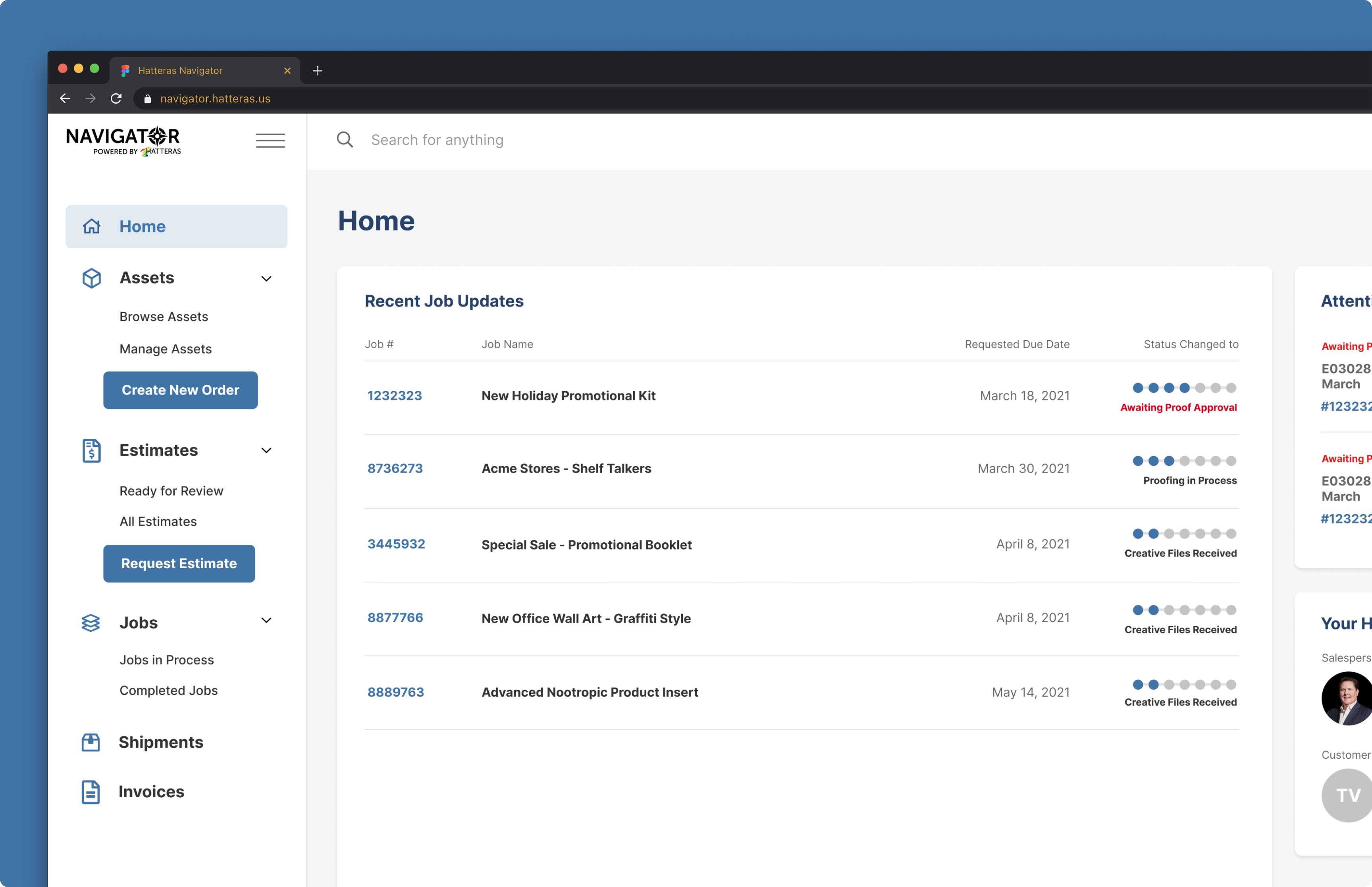
Order Page User Interface Design - prioritized panels were organized so that all personas could quickly see important information regardless of role. This streamlined view took several iterations to get to, but in the end we were able to cover all persona needs within one view which helped shave time from a development perspective.

Job Ticket Request User Interface Design - one of the critical processes for getting a project through the system is creating the "Job Ticket". This is the requirements which are directly sent to the production team for manufacturing the job properly. Historically, this process took several emails and conversations to hand off from the customer service team to the production team...with Navigator it's a single page of inputs. This was a big win for both functional groups and proved to be a massive time saver.

Proof Approval User Interface Design - another time consuming and manual process converted into a seamless and efficient UX for both Hatteras and the customer. Customers could now approve or request a revised proof directly within the system...including the ability to upload new artwork and provide comments (see below).

Real-time, automatic system-generated communications proved to be another critical component of the overall UX. We worked to create effective triggers and designed specific email outputs for each of the critical status/change updates that made sense...both for internal/cross-functional communications within Hatteras and also for the customer.

Email communication templates sample. The goal was to delineate internal vs. external comm's with the Navigator branding only being applied to customer-facing emails.
Measuring UX Performance:
With an entirely new work management paradigm, we wanted to carefully track user satisfaction to ensure that we enabled the behavior change which was required to utilize it properly. We had to converge on a simple set of metrics that we could gauge performance quickly, while capturing deeper data to enable us to investigate anomalies.